
Easing the stress of long-distance connections
ROLE
Product Design, User Research
TIMELINE
10 Weeks
TEAM
Emily Redmond (Developer)
Mhar Tenorio (Developer)
Ada Zhou (UX Researcher)
TOOLS
Figma
Adobe Photoshop

Long-distance relationships between friends and family are harddd!
Hectic days, different time zones, and awkward, high-stakes communications platforms may result in guilt and weakening connections.
Ping is a low-stress, convenient messaging app to show your loved ones you are thinking of them by exchanging thoughtful tokens and maintaining connection goals.
Outcome
User Research
We conducted 12 interviews with family members, friends, and romantic partners involved in new long-distance relationships to learn about their experiences being apart. Many expressed how it takes longer to be emotionally settled than physically settled when moving away. We focused on the perspectives of 3 of our interviewees: Abby, Hariette, and Rohan (pseudonyms).
Abby, a 25-year-old professional who moved to New York, stopped talking to her friends when she felt insecure that her frequent messages made her seem more committed to the friendship than they were.

Hariette, a 51-year-old woman who has moved 12 times, feels that maintaining relationships doesn’t get easier with each move and wants to feel ownership of how she connects with people she leaves behind.

Rohan, a 23-year-old graduate currently moving internationally to Puerto Rico, finds it challenging to maintain friendships over huge time zones amidst the stress of uprooting to a new country.

Ultimately, we wondered:
How might we make showing your loved ones you are thinking of them both convenient yet still meaningful?
Experience Prototype
We first prototyped an emoji-only messaging challenge to test if people would find small tokens of conversation (i.e. emojis) emotionally substantial. Over 3 days, five pairs of users in long-distance relationships had to send their partner 1-3 emojis per day. Daily reminders were given to send their daily token.


We found that users found the challenge convenient and that the emojis improved their days. They were not stressed by the reminders and felt it helped with the lack of energy to keep up with loved ones. Even if the emoji was “random”, the recipient was glad to receive it.
Lo-Fi Prototype
The positive feedback led us to iterate a product direction and create a low-fidelity design where users can:
Create a shared Moment with a friend: A simple screen where two online users can see their profile pictures ‘hugging’ each other to feel a sense of warmth while apart.
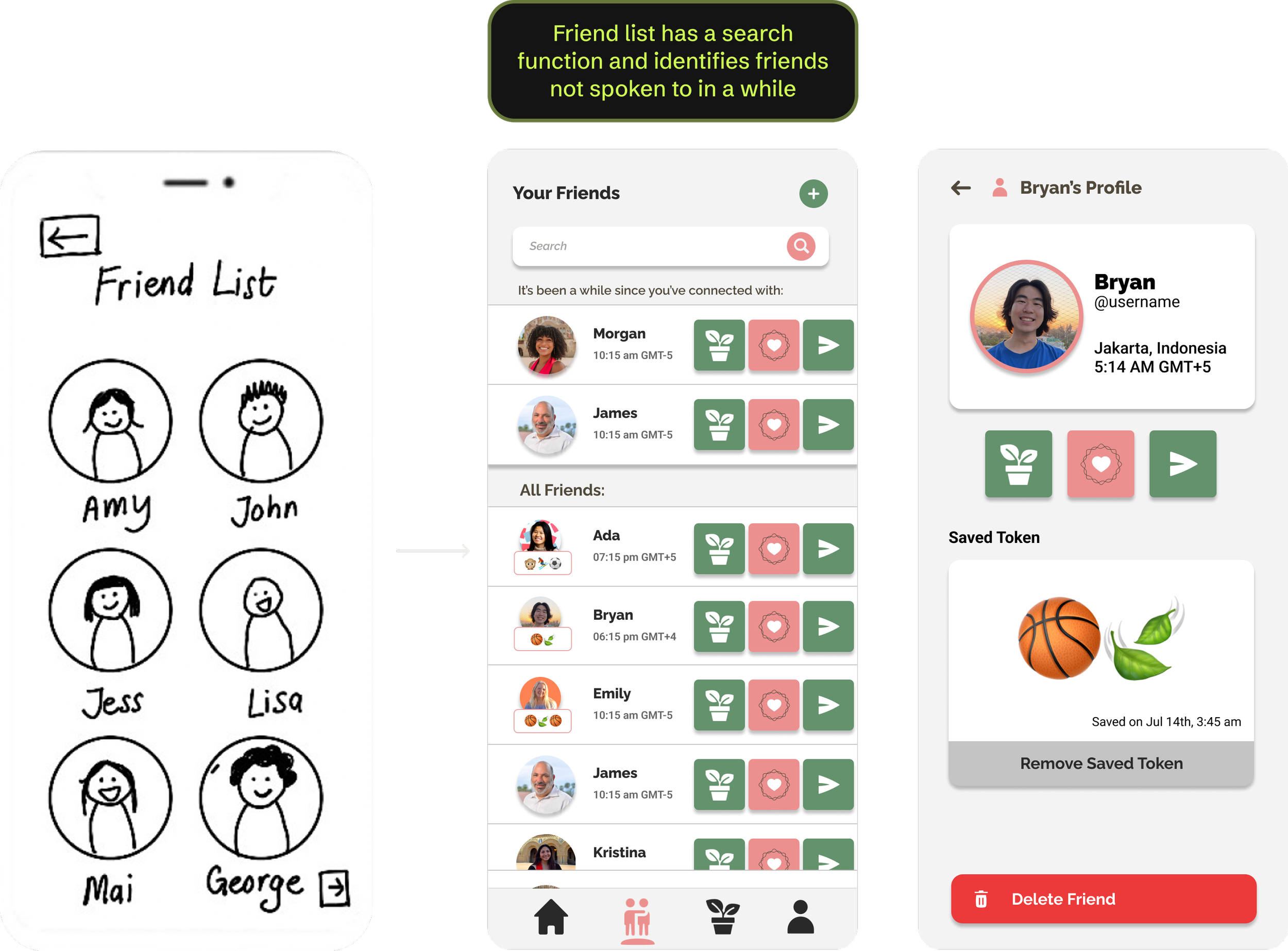
Send a Token to a friend: A string of up to five emojis to symbolize an inside joke, an event in their day, a symbol of love — anything — to let them know they are thinking of the other person.
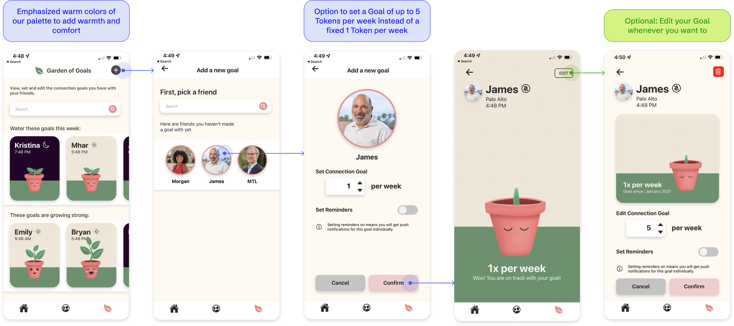
Set a Connection Goal with a friend: A plant whose growth symbolizes meeting a weekly goal to send tokens to a friend to motivate them in a visual and fun way.

Med-Fi Changes Based on User Interviews
Feedback from user tests done over Zoom revealed the need to make our design more intuitive, efficient, and delightful. I built these flows from lo- to mid- to hi-fidelity while applying input from weekly user tests:
Home Screen

Friend List
Garden of Goals

Final Flows after More User Tests
Create a Moment with a Friend


Reply or Send a Token to a Friend

Set a Connection Goal with a Friend
Onboarding Screens

Constraints are not restraints. Simple, minimal tokens of communication can greatly lift the stress of relationships while still providing delight and connection on both ends. Nevertheless, it cannot replace more substantial interactions like an intentional catch-up call.
As a designer, I also learned that...
Emotional connection is only one part of the picture. To put myself in someone’s shoes, I need to pair that connection with a clear understanding of the tools and experiences that my users interact with. This has led me to uncover needs I hadn’t considered, rethink priorities on my screens, and let go of designs I once thought were more useful.
Diverse user research is essential to learn about different users’ habits and wants. It was meaningful to learn about various people’s experiences, but also insightful to know how those experiences might influence the app’s product direction.
Time restrictions mean we must make trade-offs between initial design goals and final deliverables. If we had more time, for instance, we would have loved to add a haptic functionality to our Moments screen where tracing a line of light on your screen would show up on your friend’s screen.